

Designing for Clarity at Scale
Commvault helps organizations protect, secure, and recover data across cloud, SaaS, and on-premises environments.
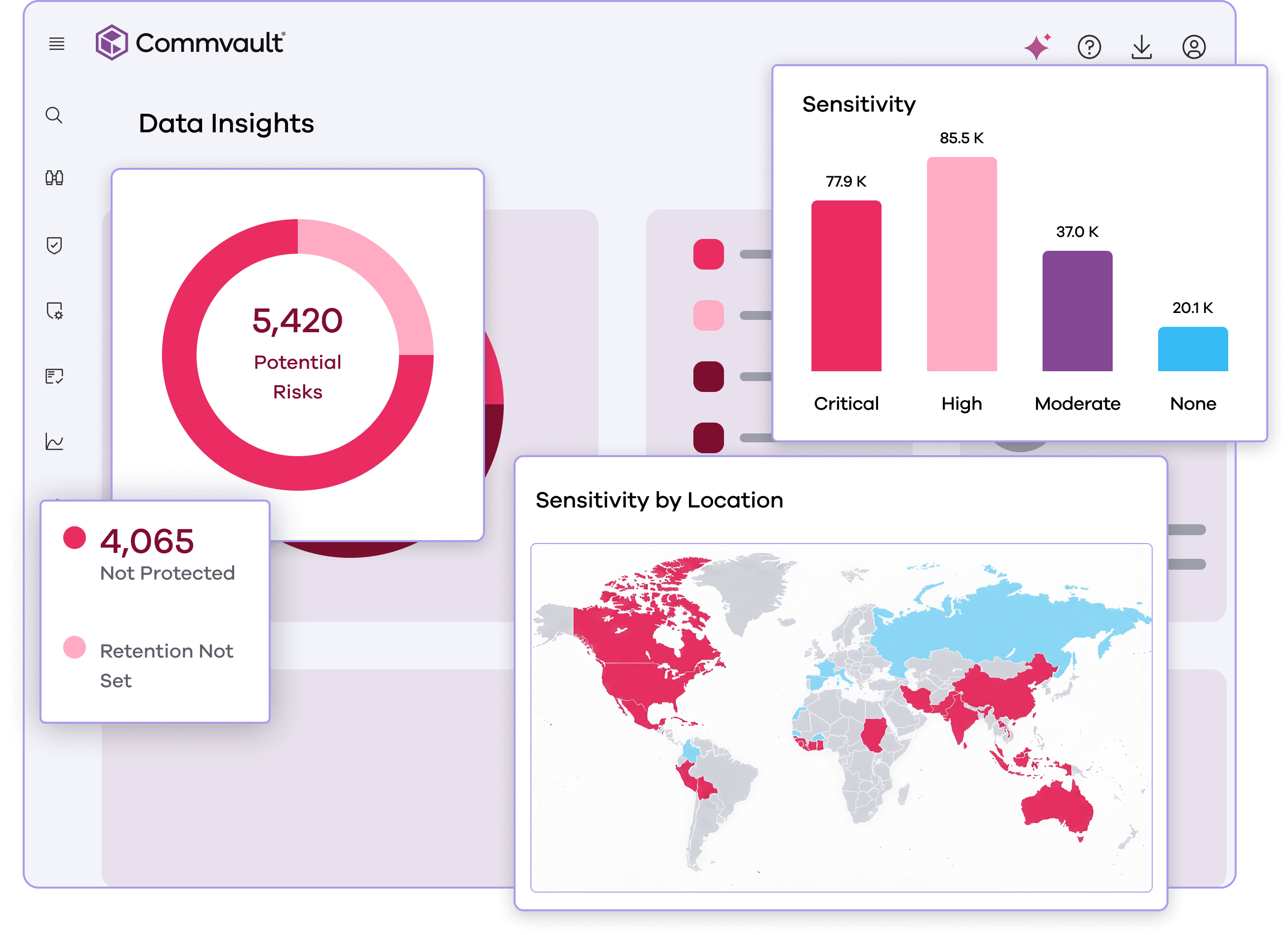
I created a reusable product-visual system that helped prospective customers understand complex enterprise capabilities while reducing reliance on quickly outdated screenshots.
01 Project Overview
Commvault needed a clearer and more durable way to represent its product online.
My mission was to create a standardized product-communication system that could focus each visual on one capability, remain recognizable to the real product, and scale across 70+ placements on Commvault.com.
My Role
Owned the website image audit, communication strategy, UI abstraction, pilot designs, and reusable Figma system.
Challenge
The solution needed to simplify complex enterprise workflows without misrepresenting the product or becoming another maintenance burden.
Approach
Audited 70+ placements, established abstraction and presentation standards, redesigned five pilot assets, and built reusable components for broader adoption.
Outcome
Participants were 25% more likely to identify the intended product capability from the stylized UI than from the original screenshots.
02 Understanding the Problem
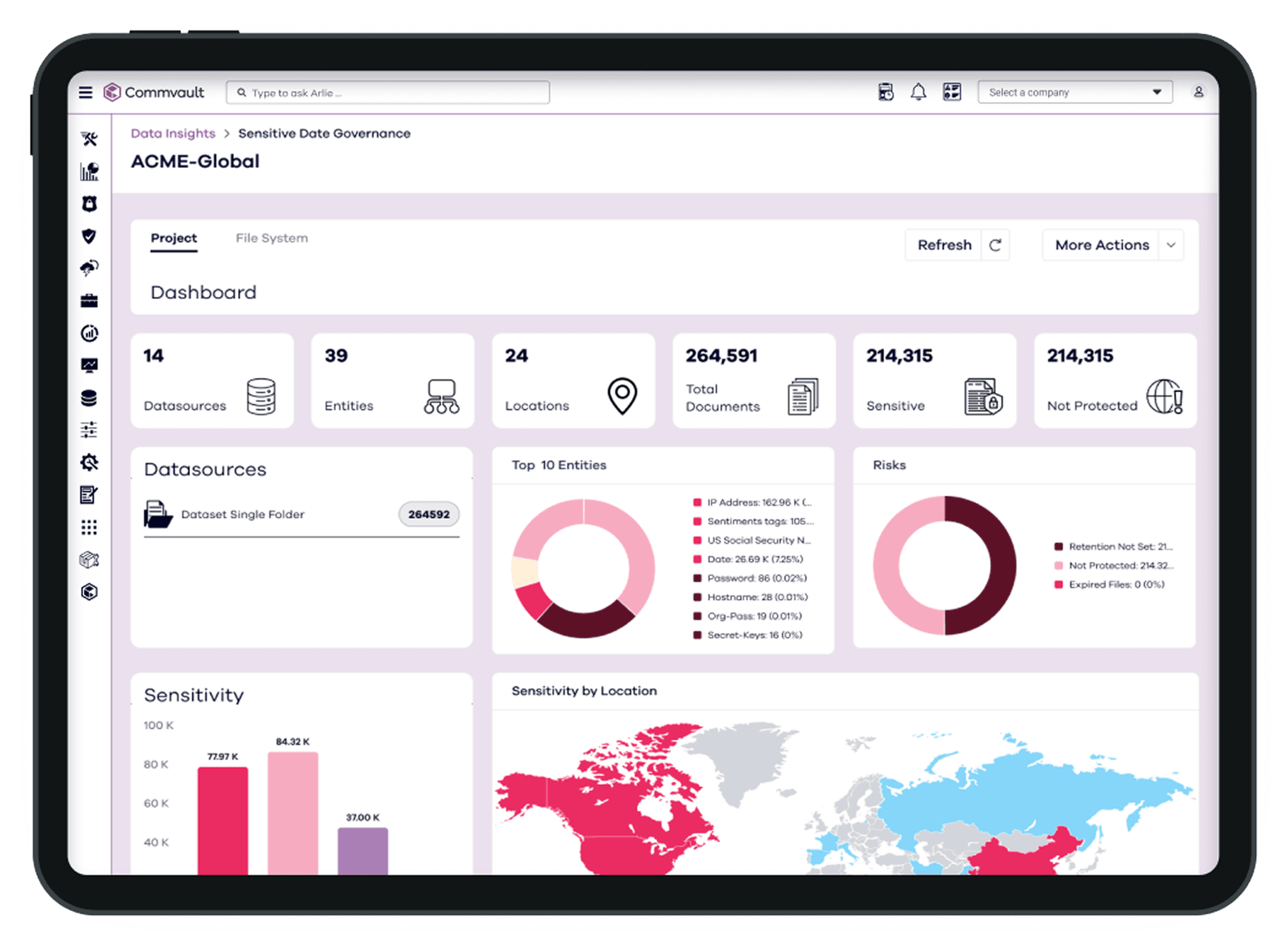
Commvault used a mix of raw screenshots, tightly cropped interfaces, and device mockups. The inconsistency made capabilities harder to understand and required frequent updates as the product evolved.
Product Context
Commvault helps organizations protect, manage, and recover data across cloud, SaaS, and on-premises environments.
Core Issue
Prospective customers had to interpret dense interfaces to understand individual capabilities, while the web team lacked a consistent and maintainable way to present product imagery.
How might we...
How might we make complex product capabilities easier to understand without depending on frequently replaced screenshots?
03 Website Image Audit to Define Project Scope
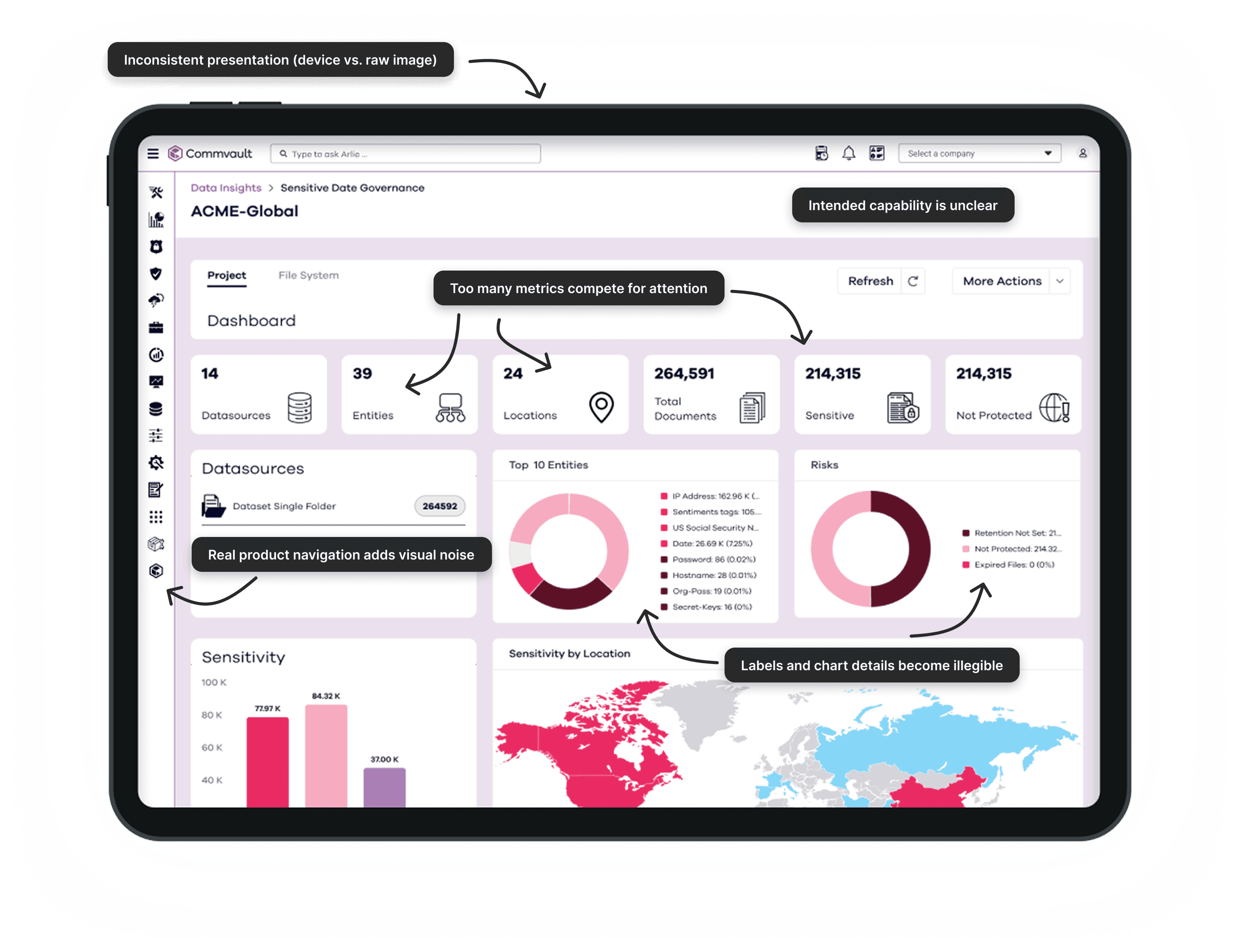
I audited 70+ product-image placements across Commvault.com, evaluating each image for message clarity, readability, consistency, product accuracy, and maintenance risk.
Key findings
- Screenshots communicated too muchNavigation, controls, tables, and technical data competed with the capability each page was intended to explain.
- Important details became unreadableFull-screen interfaces were reduced to fit website modules, making labels and data difficult to read.
- Presentation was inconsistent and difficult to maintainScreenshots varied in framing, scale, cropping, and device treatment, and quickly became outdated when the product UI changed.
 Light mode annotated screenshot
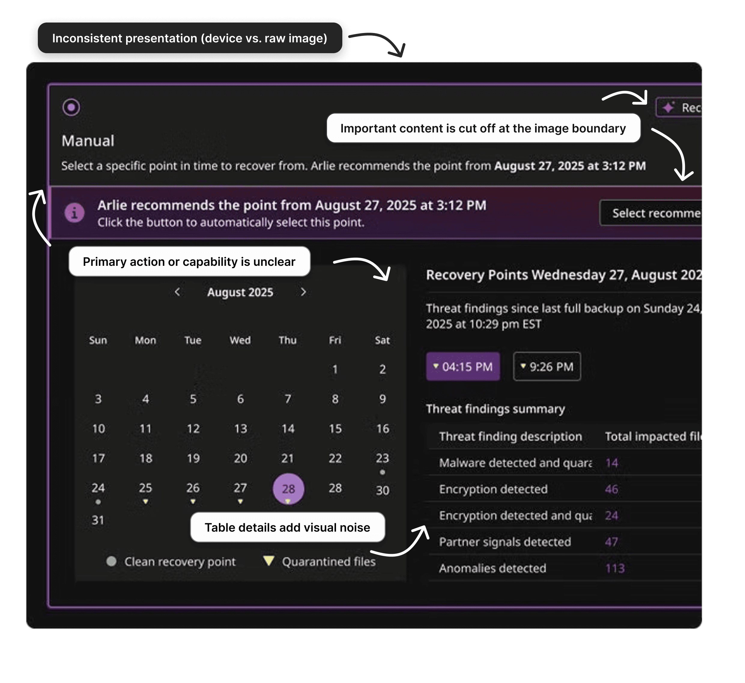
Additional audit example
 Dark mode annotated screenshot
The source image was already cropped on Commvault.com; this was not a display error in the case study.
04 Design Constraints
Design Constraints
The system needed to balance product accuracy with communication clarity while remaining reusable as the interface evolved.
Simplify without misrepresenting
- Preserve recognizable workflows, relationships, and terminology.
- Remove only details unrelated to the intended capability.
- Avoid implying interactions or functionality that did not exist.
Design for scale and change
- Support 70+ placements across multiple product areas.
- Avoid dependence on interface details likely to change.
- Make components and guidelines reusable by other teams.
Rather than redesigning each screenshot independently, I created an abstraction framework and modular Figma system that preserved product accuracy while making visuals clearer, more consistent, and easier to maintain.
05 Design Responses to Key Findings
Design Responses to Key Findings
I focused on three connected solutions that improved product comprehension while making the system scalable, accurate, and easier for the web team to maintain.
01
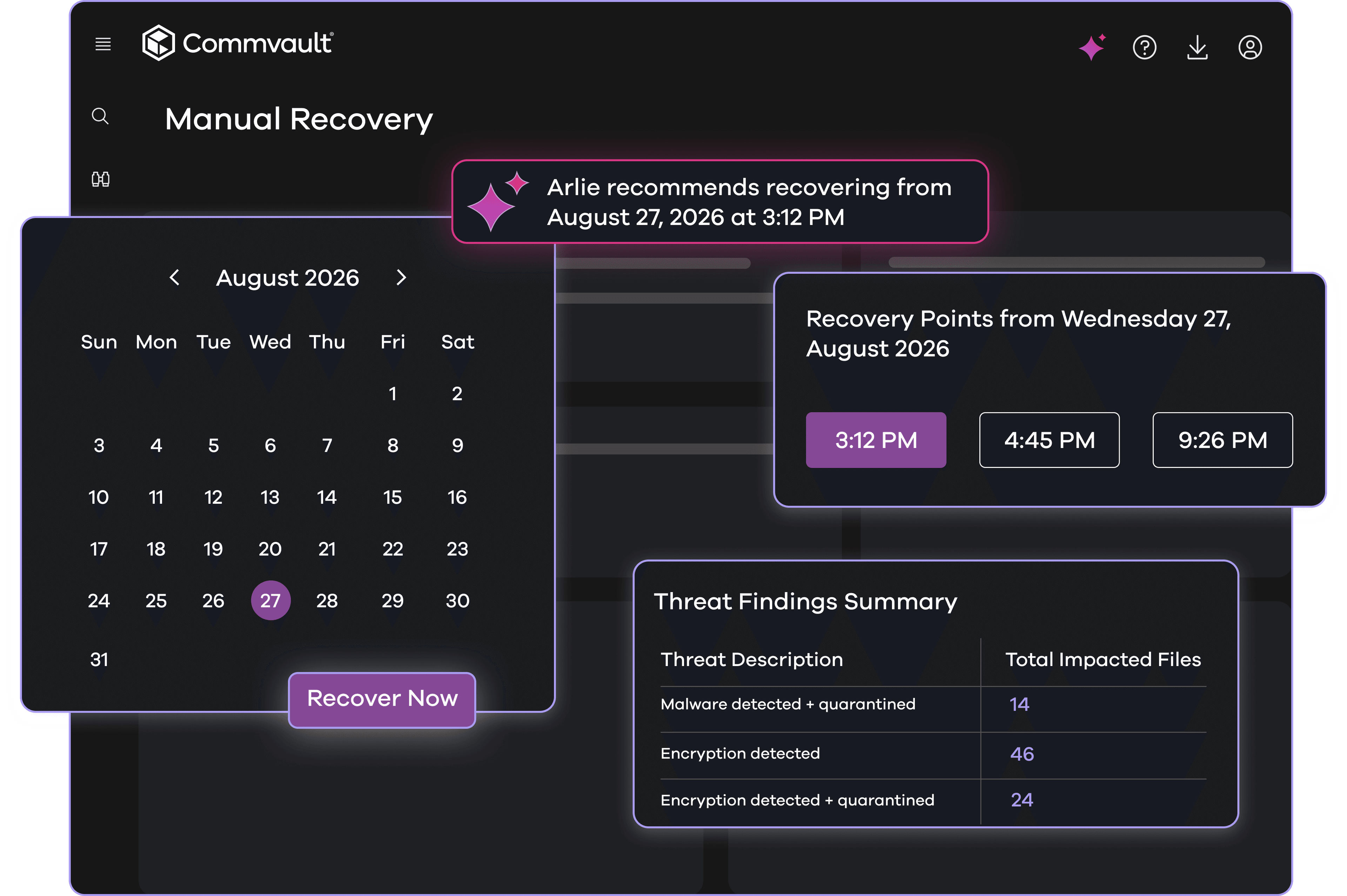
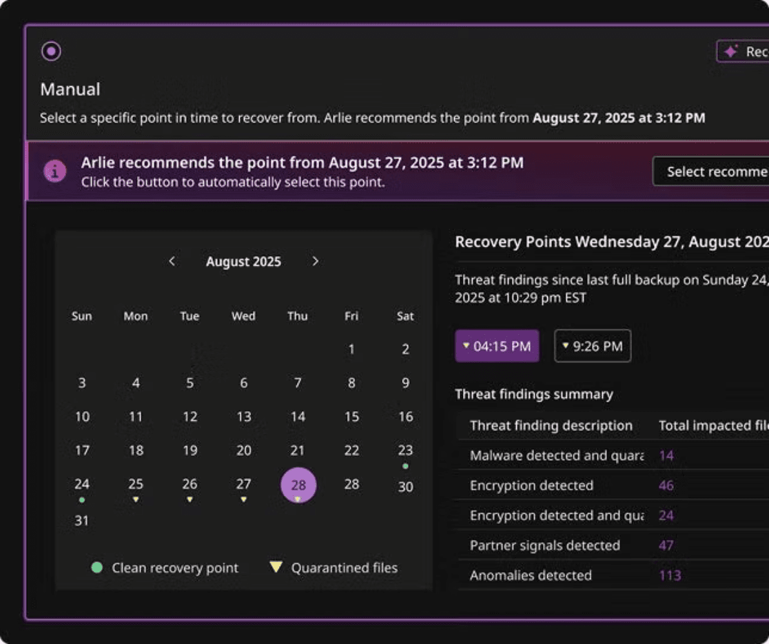
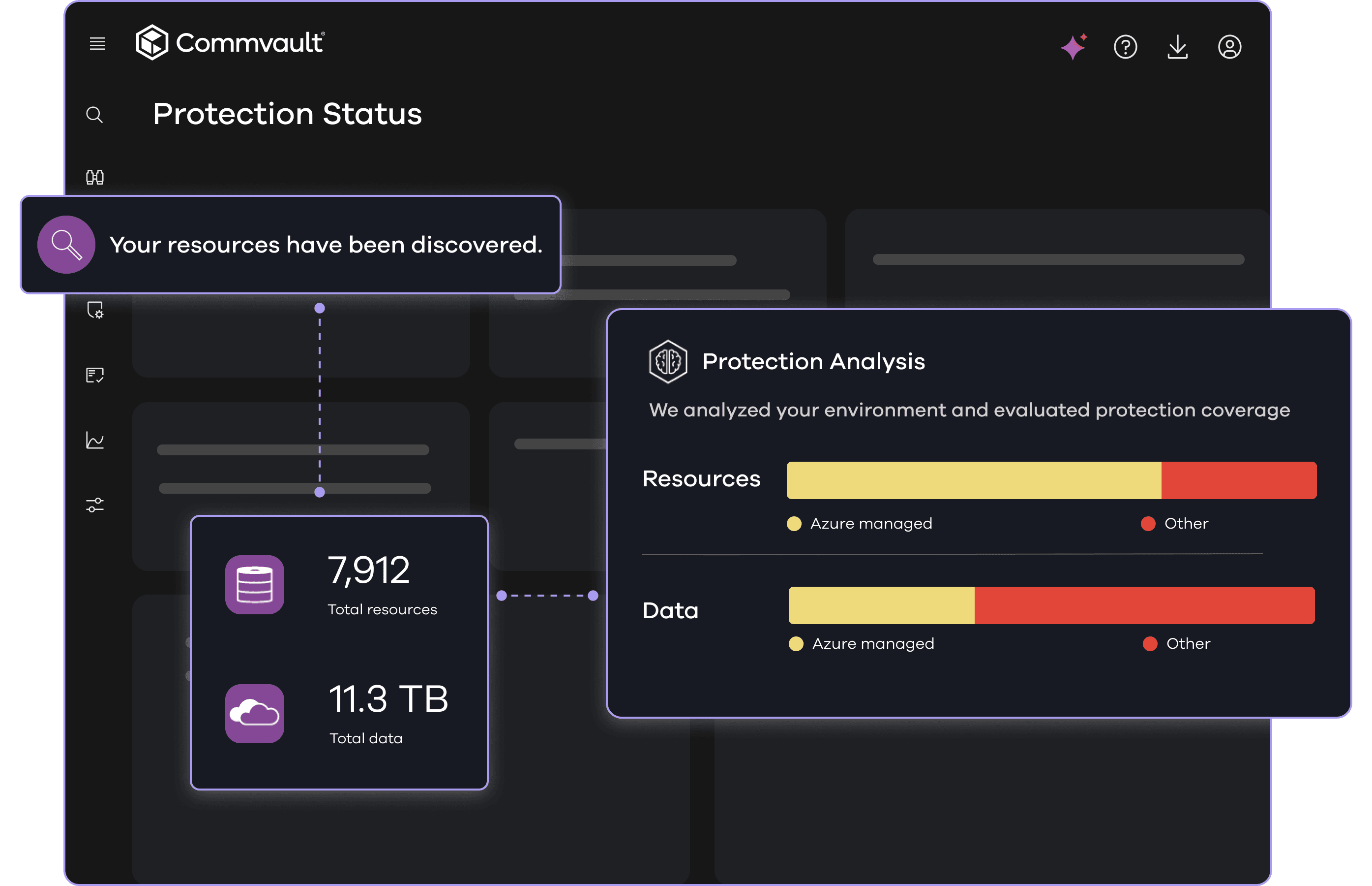
Clarifying the Product Story
Problem
Raw screenshots presented the full product interface even when the page was communicating one specific capability. Secondary controls, navigation, and technical data competed with the intended message and made it difficult to identify what mattered most.
Decision
I redesigned each visual around a single communication goal, emphasizing the product action or insight tied to the page's value proposition while simplifying or removing details that did not support it.
Justification
Marketing visuals do not need to explain the entire interface. They need to provide enough recognizable product context to communicate one capability clearly and credibly. This approach preserved the meaning of the product experience while reducing unnecessary visual complexity.

02
Building a Scalable Visual System
Problem
Redesigning every product image independently would create a new version of the same maintenance problem. Repeated interface patterns would need to be rebuilt, and visual decisions could become inconsistent across products and pages.
Decision
I created a modular Figma system with reusable components, templates, and layout patterns for common product elements such as navigation, cards, tables, charts, filters, labels, and status indicators.
Justification
Standardizing recurring patterns made the process faster and more consistent while still allowing each visual to communicate a different capability. The system also gave the web team a shared foundation for creating and updating future assets without starting from scratch.
03
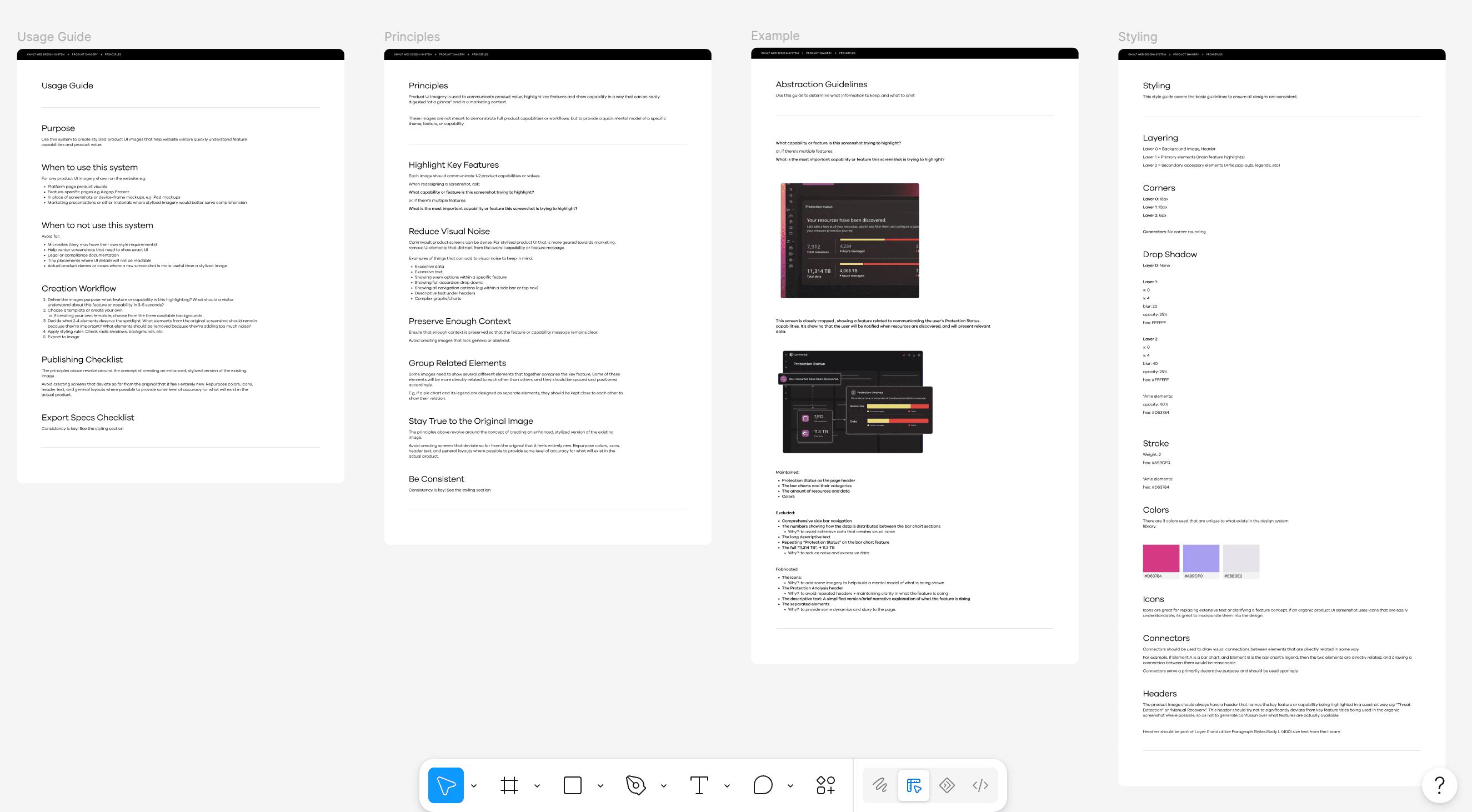
Standardizing Product Representation at Scale
Problem
Simplifying complex interfaces without shared guidance could produce visuals that were inconsistent, misleading, or difficult for other designers to recreate and maintain.
Decision
I documented a complete usage framework for the system, including design principles, abstraction rules, product-accuracy requirements, creation workflows, and visual specifications. Together, these guidelines defined when to use the system, what information to preserve or remove, and how future assets should be constructed and reviewed.
Justification
Reusable components alone could standardize the appearance of the visuals, but not the decisions behind them. Combining the Figma library with shared principles and specifications helped preserve product accuracy, create consistency across teams, and make the system easier to scale responsibly.
06 Validating the Direction
Validating the Direction
After creating the stylized visuals, I tested whether users would actually experience greater comprehension viewing the stylized vs. original images.
Finding 01
Stylized UI improved capability identification
25% higher correct capability identification
Participants viewing the stylized UI correctly identified the intended capability in 67% of tasks, compared with 53% for the existing screenshots - a 13.5-percentage-point increase, or a 25% relative improvement.
Correct product capability identification
Percentage of image evaluations in which participants selected the intended capability.
Finding 02
The information felt better balanced
83% “just right”
Participants rated the amount of information as “just right” in 83% of stylized-UI evaluations, compared with 56% of existing-screenshot evaluations.
This suggested that the new visuals removed distracting detail without leaving most participants feeling that important information was missing.
Perceived amount of information
07
Outcomes
Although the broader rollout is still in progress, the project established a validated and approved direction for communicating complex product capabilities across Commvault.com.
01
Validated Comprehension
Stylized UI produced 25% higher capability identification than the existing screenshots in a directional comparison study.
02
Approved Direction
Five pilot visuals and the supporting system received department and executive approval for broader use.
03
Reduced Maintenance Burden
The system created a more durable approach for 70+ potential placements, reducing dependence on screenshots that require replacement whenever the product UI changes.
08 Takeaways
Takeaways
Simplification is an information-design decision, not just a visual one.
The strongest visuals focused attention on one capability while preserving enough product context to remain accurate and credible.
More information can create confidence without comprehension.
Participants viewing the raw screenshots felt more confident despite identifying the intended capability less accurately. This reinforced the importance of measuring what users actually understand, not only how clear a visual feels.
Scalability requires components, rules, and lifecycle thinking.
Reusable components created consistency, while abstraction guidelines helped preserve product accuracy and reduce reliance on screenshots that can quickly become outdated.