AWS EC2 Redesign (Case Study)
Role
Product Designer
Project Type
Independent Case Study
Tools/Skills
Figma, User Research, Prototyping
Timeline
May 2025 - June 2025
AWS EC2 is one of the most widely used AWS services—but it’s notoriously hard to navigate.
I independently designed a feature concept for the EC2 desktop platform—“Beginner Mode”—aimed at improving the user experience for newcomers and enhancing the overall UI.
Prototype Overview
The Problem
AWS EC2 is flexible and powerful, but the current UI overwhelms new users with technical jargon, complex decisions, and minimal guidance. This complexity leads to fear, abandonment, or misconfiguration.
How can we enable new users to become comfortable using EC2, while not disrupting it's core functionality?
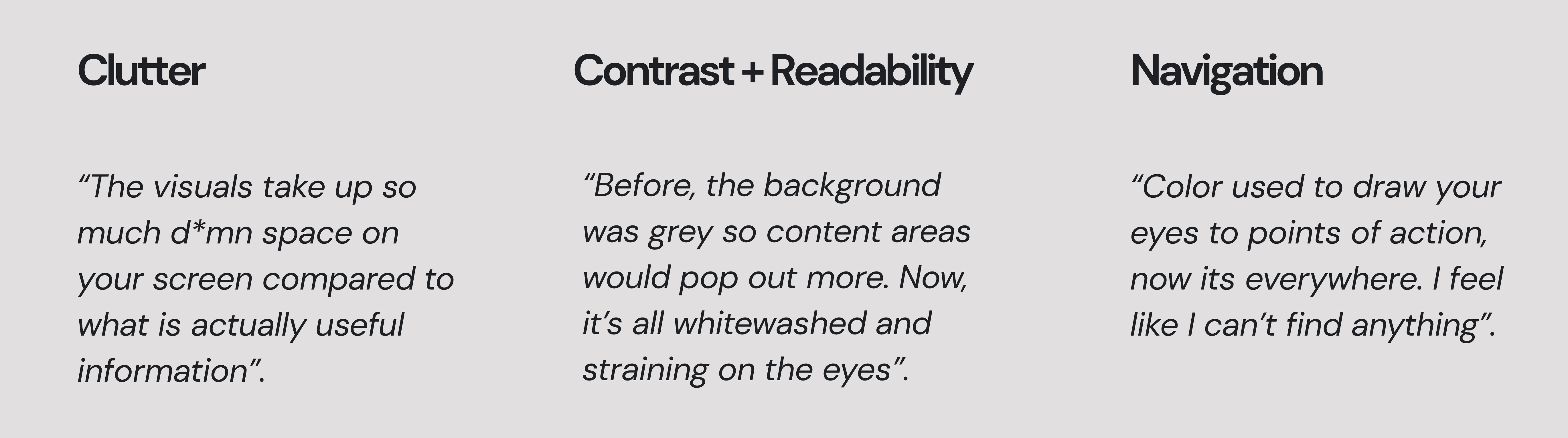
Understanding Our Users
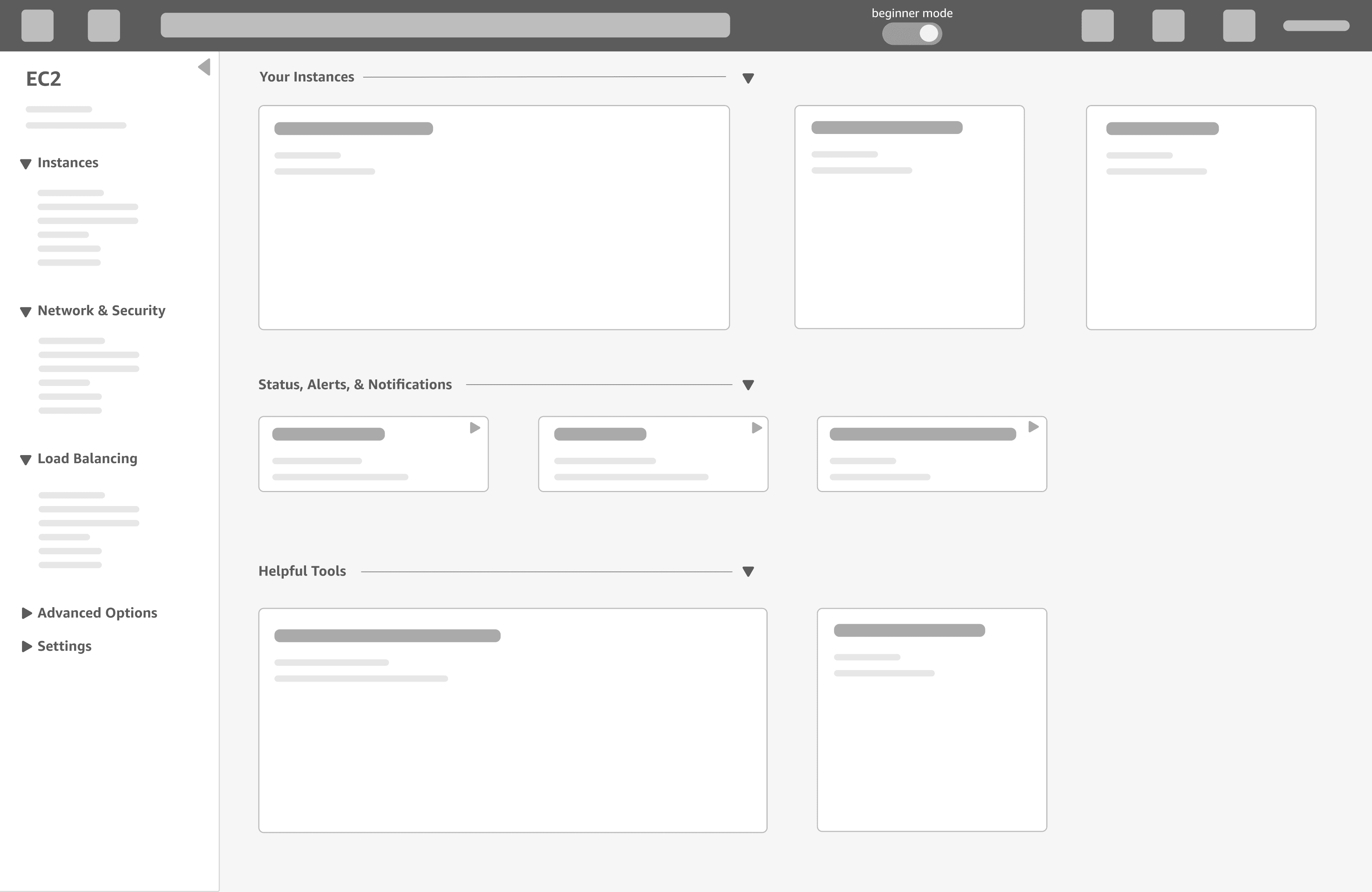
Ideation and Wireframing

Visual Design
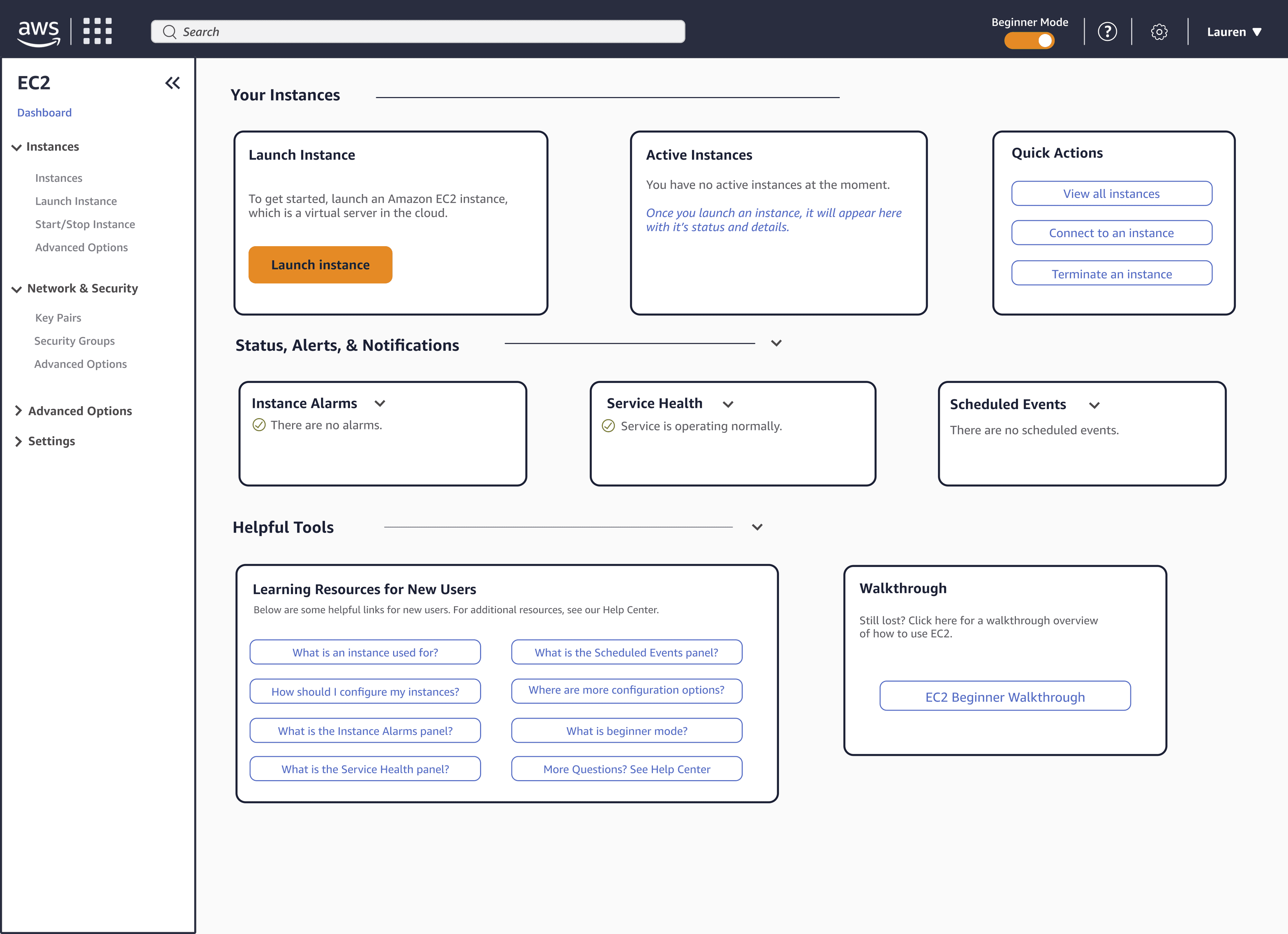
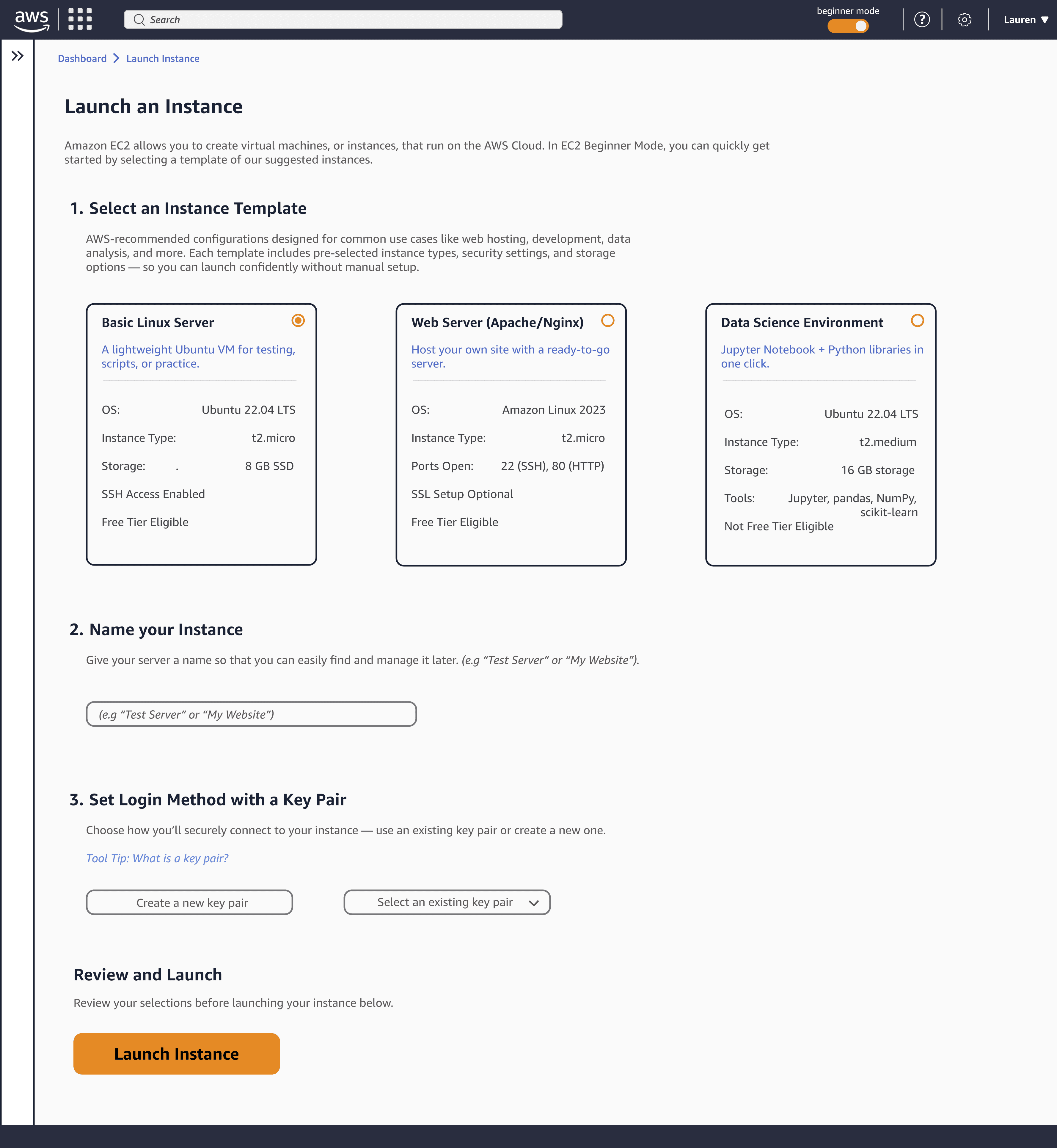
The Final Feature
Outcomes
Takeaways
User research is the foundation of it all.
Throughout my design process, I had to think critically and empathetically about each decision, connecting it back to insights from my user research. This made sure that what I was creating would effectively address the problem space.
The design process will not always look the same.
I had to invest significantly more time into understanding the product and industry for this project. I've grown to value this particular experience because I've learned my natural curiosity and approach to tackling hard subjects is a strength of mine.
The big picture: simplifying complexity isn't just helpful — it's transformative.
With thoughtful design, we can make any aspect of technology more accessible — not by stripping away functionality, but by taking the time to guide new users through it with clarity and intention.