Improving first-session activation at Learvo
Learvo is an AI-powered learning platform, offering tools like flashcards, mnemonics, and quizzes. I redesigned the first-time user experience to help new users find a clear starting point, try a core study workflow, and experience value in their first session.
Improving first-session activation
at Learvo
Improving first-session activation at Learvo
Learvo is an AI-powered learning platform, offering tools like flashcards, mnemonics, and quizzes. I redesigned the first-time user experience to help new users find a clear starting point, try a core study workflow, and experience value in their first session. Because engineering capacity was limited, I focused on strategic, lightweight improvements that could ship quickly.
Learvo is an AI-powered learning platform, offering tools like flashcards, mnemonics, and quizzes. I redesigned the first-time user experience to help new users find a clear starting point, try a core study workflow, and experience value in their first session.
Case Study Overview
Owned problem framing, prioritization, and redesign of the new user experience. I identified key friction points, designed onboarding and navigation improvements, and validated them through usability testing.
New users landed in an experience built for repeat use. There was no clear starting point, reliable home state, or obvious next step, so many dropped off before trying a core feature or experiencing value.
What I Shipped
Guided onboarding for first-time users.
An interim home state provided a clear starting point and home base.
Shared UI patterns to reduce inconsistency.
Validated in moderated usability testing: 88% of new users completed a core feature flow in their first session.
Users reported feeling oriented and clear on what to do next.
Guided onboarding for first-time users.
An interim home state provided a clear starting point + home base.
Shared UI patterns to reduce inconsistency.
Validated in moderated usability testing: 88% of new users completed a core feature flow in their first session.
Users reported feeling oriented and clear on what to do next.
Understanding The Problem
Product context: Learvo helps students turn study materials into tools (flashcards, mnemonics, and quizzes).
Core issue: Many users left before completing any of these, so they abandoned the platform before seeing value (as observed with platform analytics tools).
Product context: Learvo helps students turn study materials into active study workflows (flashcards, mnemonics, and quizzes).
For this project, first-session activation meant helping a new user successfully complete at least one core study workflow: Flashcards, Mnemonics, or Quizzes.
Core issue: many users left before completing any of these, so they abandoned the platform before seeing value.
The Process Plan
How might we help new users discover and successfully try at least one core feature in their first session (flashcards, mnemonics, or quizzes) so they experience Learvo’s value before dropping off?
The Process Plan
Prioritize (w/ constraints)
Prioritize (w/ constraints)
UX Audit to Determine Project Scope
How might we help new users discover and successfully try at least one core feature in their first session (flashcards, mnemonics, or quizzes) so they experience Learvo’s value before dropping off?
To define a focused redesign scope, I audited first-time user flows across Learvo’s core features (Flashcards, Mnemonics, and Quizzes).
To define a focused redesign scope, I audited first-time user flows across Learvo’s core features (Flashcards, Mnemonics, and Quizzes).
Key Findings:
The experience was designed for repeat use, not first-time use.
• New users were expected to self-direct before being introduced to any core feature
• The interface lacked a clear orientation point, making it harder for users to know where to start or how to navigate.
• Users encountered unfamiliar tools before they had enough context to understand their value.
Some core features were not immediately self-explanatory, making it harder for new users to understand their value.
Key Findings:
The experience was designed for repeat use, not first-time use.
New users were expected to self-direct before being introduced to any core feature
The interface lacked a clear orientation point, making it harder for users to know where to start or how to navigate.
Users encountered unfamiliar tools before they had enough context to understand their value.
Some core features were not immediately self-explanatory, making it harder for new users to understand their value.
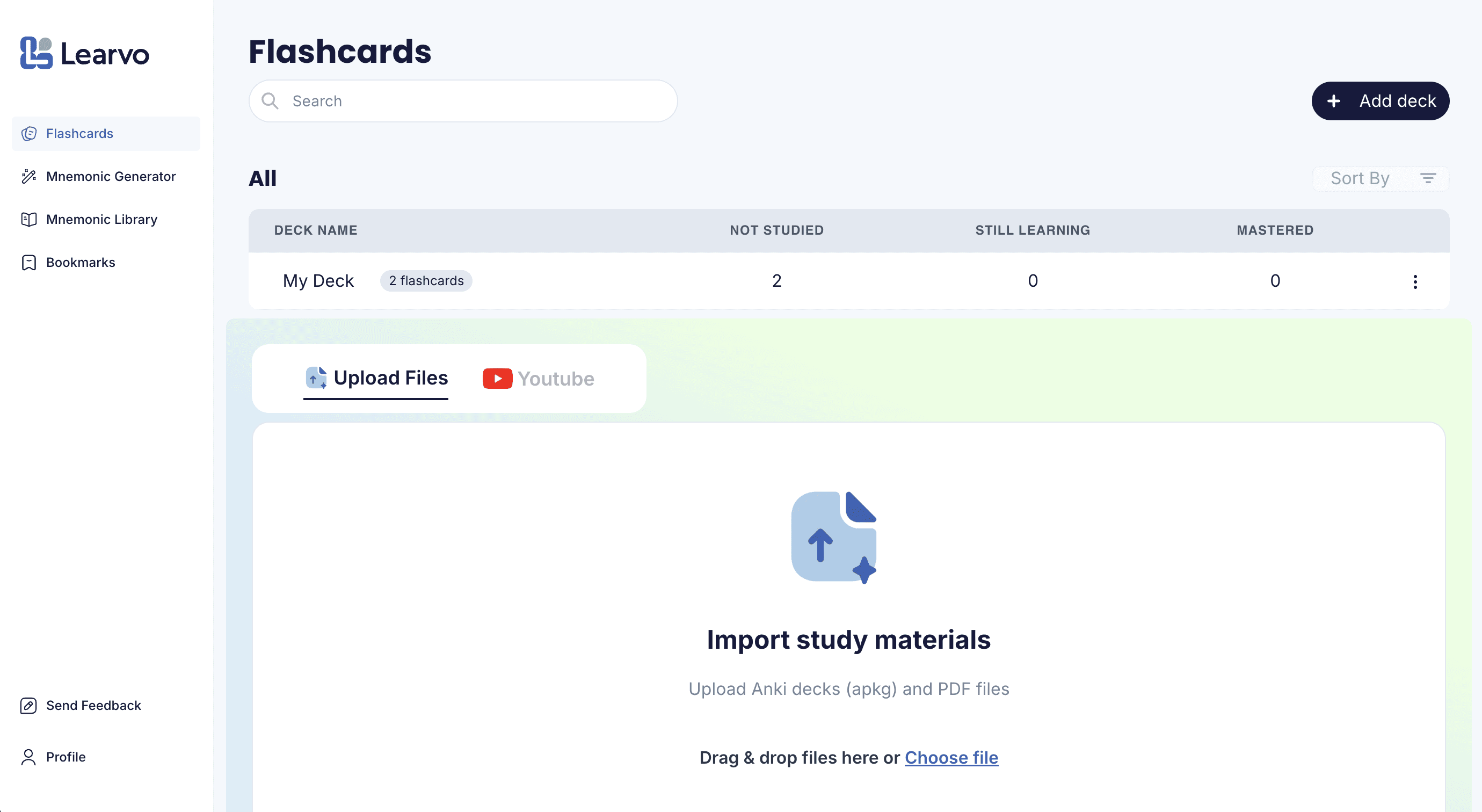
First screen shown to new users (Flashcards page)
Built for ongoing use
(table only appears if you've created a deck)
Logo linked externally, not to an in-app home
Multiple features before clear guidance
Built for ongoing use
(table only appears if you've created a deck)
Logo linked externally, not to an in-app home
Multiple features before clear guidance
Example of a less familiar tool with limited guidance (Mnemonic Generator page)
To define a focused redesign scope, I audited first-time user flows across Learvo’s core features (Flashcards, Mnemonics, and Quizzes).
Outcomes
Activation improved: 7 of 8 first-time users completed at least one core feature flow in moderated usability testing.
Feature discovery improved: participants used the in-context prompts to choose a next step without needing a separate onboarding tour.
Orientation improved: the in-app home state gave users a more predictable place to return to.
Clarity improved: customer success feedback suggested that new users felt more oriented and less overwhelmed.
Input format is not self-explanatory
Advanced options appear before the core task is clear
Input format is not self-explanatory
Advanced options appear before the core task is clear
Based on these findings, I focused the scope to changes most likely to help first-time users reach a core feature quickly: onboarding guidance, clearer orientation, and clear next steps.
Constraints
There were two primary constraints that influenced the direction of the design solutions:
Limited engineering capacity
Large structural changes weren’t feasible
Implementation moved slowly
We had to work within existing architecture
Decisions had to be made quickly
We couldn’t spend cycles designing a perfect end state
Solutions needed to be testable and fast to implement
Rather than designing a full new home or heavy setup flow, I prioritized lightweight changes that could reduce hesitation, improve orientation, and help users reach a core feature in their first session.
How we're defining success:
New users complete at least one core feature flow in their first session (activation)
Users report feeling oriented, not overwhelmed or lost
There were two primary constraints that influenced the direction of the design solutions:
Rather than designing a full new home or heavy setup flow, I prioritized lightweight changes that could reduce hesitation, improve orientation, and help users reach a core feature in their first session.
How we're defining success:
New users complete at least one core feature flow in their first session (activation)
Users report feeling oriented, not overwhelmed or lost
How we're measuring success:
Moderated usability completion rate (completing a core feature flow)
Observed hestitation
Navigation confusion or backtracking
Qualitative user feedback
How we're measuring success:
Moderated usability completion rate (completing a core feature flow)
Observed hestitation
Navigation confusion or backtracking
Qualitative user feedback
Defining Success
How we're defining success:
New users complete at least one core feature flow in their first session (activation)
Users report feeling oriented, not overwhelmed or lost
How we're measuring success:
Moderated usability completion rate (completing a core feature flow)
Observed hestitation
Navigation confusion or backtracking
Qualitative user feedback
Rather than designing a full new home or heavy setup flow, I prioritized lightweight changes that could reduce hesitation, improve orientation, and help users reach a core feature in their first session.
In-context activation banner
In-context activation banner
For new users: the page provides a clear starting point through the activation banner, while Recently Studied sets the expectation for what will appear after first use.
After first progress, the same page becomes a more useful home state, with Recently Studied, progress cues, and resume actions that help users continue their work.
There were two primary constraints that influenced the direction of the design solutions:
Design Responses to Key Findings
Design Responses to Key Findings
.
Problem: New users weren’t given a clear starting point, which created hesitation before first action. Within the features themselves, the path to getting value was not always immediately obvious.
Decision: I paired an in-context activation banner with lightweight, step-based in-feature tutorials to guide users without forcing a linear onboarding flow.
Why: We ruled out (1) a dedicated Home + setup flow (too time-intensive for a small team) and (2) a mandatory full-screen onboarding tour (too interruptive, higher skip risk). This approach balanced speed-to-ship with meaningful first-session guidance.
In-context activation banner
In-context activation banner
Surfaced key activation paths (quizzes, flashcards, mnemonics)
Clear CTA with progress indication
Surfaced key activation paths (quizzes, flashcards, mnemonics)
Clear CTA with progress indication
Step-based in-feature tutorial
Step-based in-feature tutorial
Step-based guidance reduces confusion
Clear progress through the task
Step-based guidance reduces confusion
Clear progress through the task
Creating an Interim Home State
Creating an Interim
Home State
Problem: Users lacked a reliable “home” to return to, which caused disorientation and backtracking. In pre-change usability observations, users repeatedly clicked the Learvo logo expecting it to take them home, but it redirected to the public signup page instead.
Decision: I repurposed the Flashcards page into an interim home state by combining first-time guidance with return-and-resume signals: the activation banner, Recently Studied, progress cues, and reliable logo-to-home behavior.
Why: A dedicated Home page was the ideal long-term solution, but shipping a net-new page wasn’t feasible within the timeline. Instead, I took an incremental approach by making an existing high-traffic page function more like a home first.
For new users: the page provides a clear starting point through the activation banner, while Recently Studied sets the expectation for what will appear after first use.
For new users: the page provides a clear starting point through the activation banner, while Recently Studied sets the expectation for what will appear after first use.
When you upload and study a quiz or flashcard deck, your progress will appear here!
Prompts upload as another starting path
Establishes where progress will live: ("I should return here")
Provides clear starting point
After first progress, the same page becomes a more useful home state, with Recently Studied, progress cues, and resume actions that help users continue their work.
After first progress, the same page becomes a more useful home state, with Recently Studied, progress cues, and resume actions that help users continue their work.
Table feature before and after redesign
Upload feature before and after redesign
Library and upload keep review and next steps in one place
Visual Design: Supporting UI Improvements
Visual Design:
Supporting UI Improvements
Problem: The table and upload features lacked clear hierarchy and polish, which made the product feel harder to parse and less trustworthy.
Decision: I redesigned the table and upload features to improve hierarchy, readability, and overall product polish, while utilizing style guides to apply more consistent shared patterns across these high-use surfaces.
Why: These changes supported the activation work by making core surfaces feel clearer, more trustworthy, and easier to scan during first use.
Table feature before and after redesign
Table feature before and after redesign
Upload feature before and after redesign
Upload feature before and after redesign
Walkthrough: First-time experience
Walkthrough: First-time experience
Outcomes
Activation improved: 7 of 8 first-time users completed at least one core feature flow in moderated usability testing.
Feature discovery improved: participants used the in-context prompts to choose a next step without needing a separate onboarding tour.
Orientation improved: the in-app home state gave users a more predictable place to return to.
Clarity improved: customer success feedback suggested that new users felt more oriented and less overwhelmed.
1. Activation depends on helping users reach value quickly.
The biggest barrier wasn’t feature depth — it was helping new users take one successful first step.
2. Better orientation mattered more than a larger rebuild.
A clearer home state, progress cues, and guided next steps reduced confusion without needing a net-new homepage.
3. Small, targeted changes can meaningfully improve first-session UX.
Working within constraints led to faster, testable improvements that made the product feel clearer and more usable.